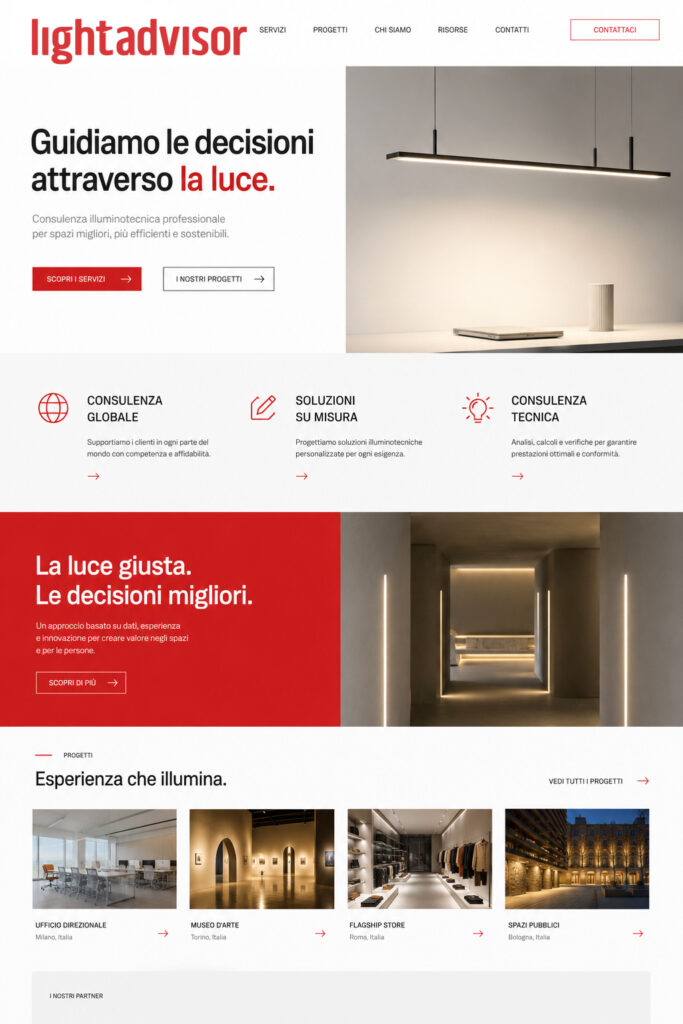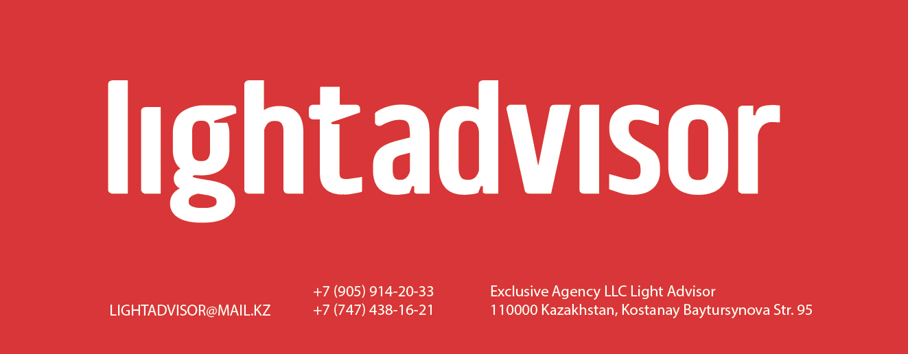
Light Advisor — Simplicity as a Sign of Trust
There is something timeless about a well-designed wordmark. No symbols, no decorative effects, no visual noise—just a name, typography, and confidence.
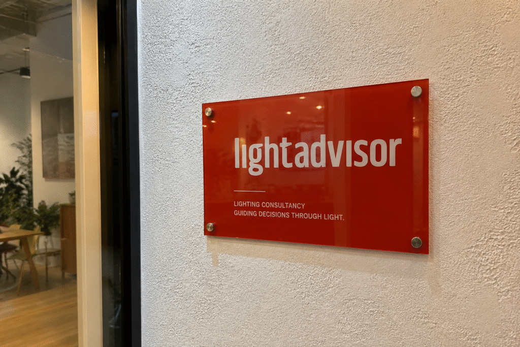
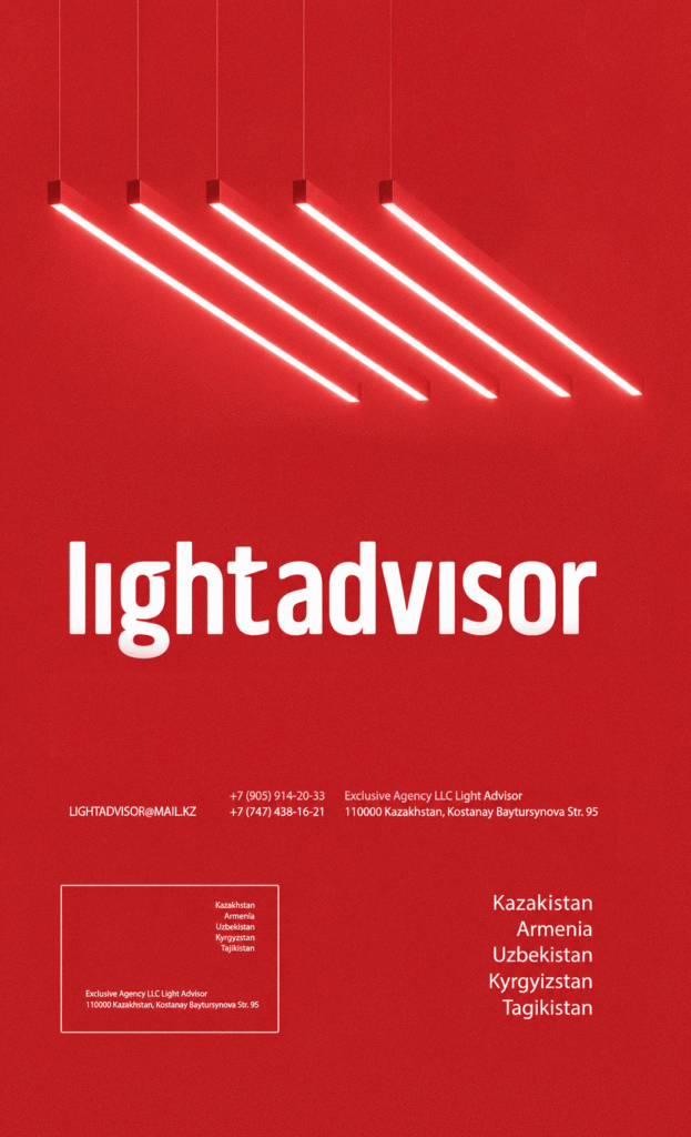
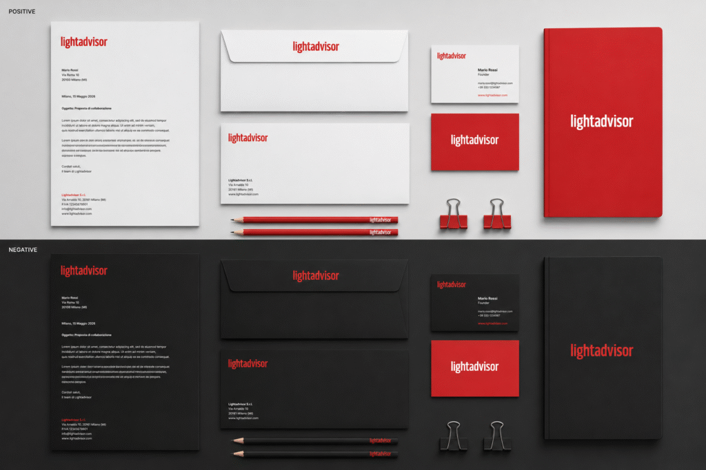
The typography was selected for its clarity, balanced proportions, and straightforward appearance. These qualities align with the characteristics often associated with contemporary technical lighting products: linearity, precision, and visual restraint.
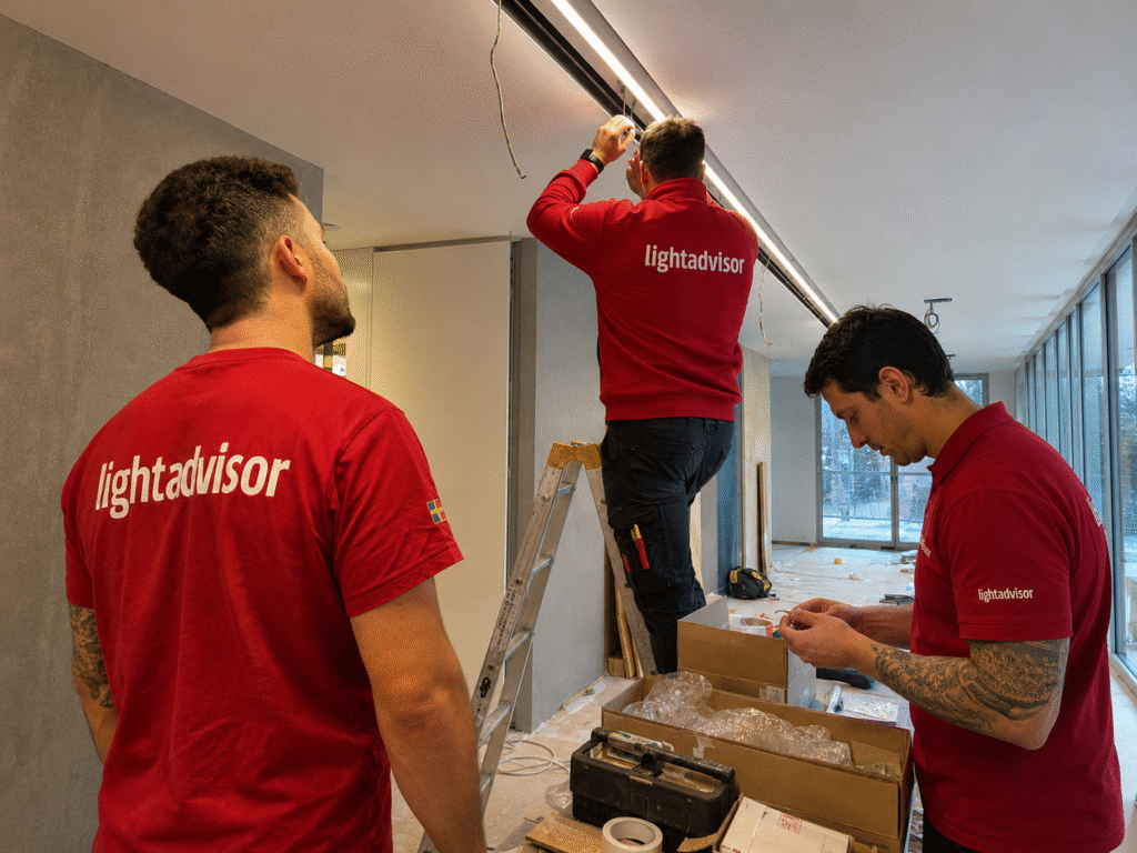
Red was adopted as the primary color to ensure visibility and contrast across applications, while the overall graphic system remains minimal and consistent.
The project explores how a limited set of visual elements can communicate reliability and professionalism without relying on decorative features or complex formal gestures.