

Refreshing the visual identity for an old textile factory in Moscow. STK union of textile companies (союз текстильных компаний) founded at pre-revolutionary times, needed a new fresh start that can valorise their glorious history.
The State quality mark of the USSR was the main visual communication relevant for this company from ’67 to ’91.

The marketing team at STK wanted to keep the pentagon and the corporative green as distinctive signs
I started our visual research studying the motifs of the USSR and prerevolutionary Russian Folk textile art
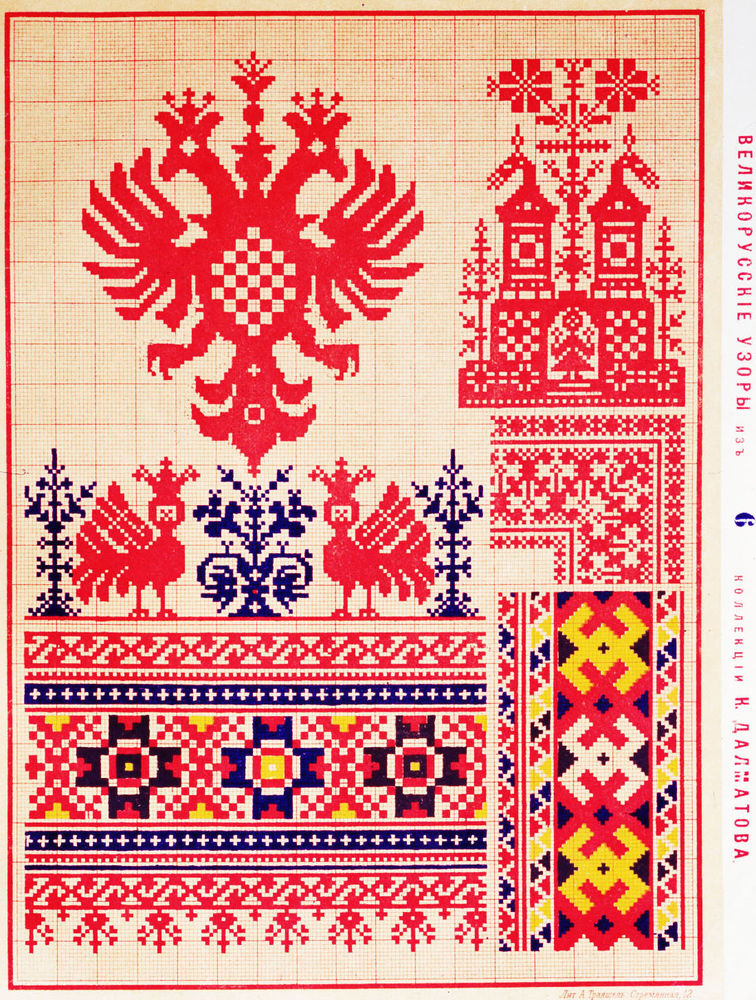
I noticed how the the soviet artists adapted the traditional Russian patterns to the idea that “Everyday work is a step towards Communism” (read more here)
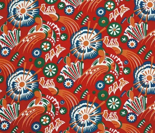
I had some fun with pattern experiments

And then using motifs for branding
The main goal for STK was create a logo that works well as label on various textile products.

The help of two great designers and yet great friends of mine (Tasia, Maurizio) was needed to develop a brand book in RU and ENG


